Advanced methods
Every example here runs when the documentation is built, so nothing on this page can drift from the code.
The thread running through all of it: an estimate of a trend is not worth much without a statement of how sure you are. Each method below reports one, and which machinery produces it depends on what the smoother is.
import numpy as np
import pandas as pd
import matplotlib.pyplot as plt

from incline import (
    SavitzkyGolay, LocalPolynomial, GaussianProcess, StateSpace,
    gp_trend, kalman_trend, sgolay_trend, local_polynomial_trend,
    deseasonalize, trend_with_deseasonalization,
    SiZer, sizer_analysis, estimate,
)

rng = np.random.default_rng(7)
n = 200
t = np.arange(n, dtype=float)
index = pd.date_range("2020-01-01", periods=n, freq="D")
Gaussian process regression
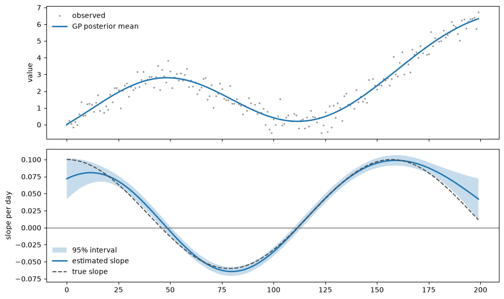
The derivative of a Gaussian process is itself a Gaussian process. Its posterior mean and variance both follow from differentiating the covariance function. The reported standard error is conditional on the fixed or fitted kernel hyperparameters; it does not propagate uncertainty from estimating them.
truth = 0.02 * t + 2 * np.sin(t / 25)
true_slope = 0.02 + 2 * np.cos(t / 25) / 25
df = pd.DataFrame({"value": truth + rng.normal(0, 0.5, n)}, index=index)

gp = gp_trend(df, kernel="rbf", with_uncertainty=True)
gp[["derivative_value", "derivative_standard_error", "uncertainty_method"]].head()
| derivative_value | derivative_standard_error | uncertainty_method | |
|---|---|---|---|
| 2020-01-01 | 0.071831 | 0.015269 | native |
| 2020-01-02 | 0.073258 | 0.014532 | native |
| 2020-01-03 | 0.074572 | 0.013811 | native |
| 2020-01-04 | 0.075769 | 0.013105 | native |
| 2020-01-05 | 0.076845 | 0.012418 | native |
fig, axes = plt.subplots(2, 1, figsize=(10, 6), sharex=True)

axes[0].plot(t, df["value"], ".", color="0.6", ms=3, label="observed")
axes[0].plot(t, gp["smoothed_value"], lw=2, label="GP posterior mean")
axes[0].set_ylabel("value")
axes[0].legend(frameon=False)

axes[1].fill_between(
    t, gp["derivative_ci_lower"], gp["derivative_ci_upper"],
    alpha=0.25, label="95% interval",
)
axes[1].plot(t, gp["derivative_value"], lw=2, label="estimated slope")
axes[1].plot(t, true_slope, "--", color="0.3", lw=1.5, label="true slope")
axes[1].axhline(0, color="0.4", lw=1)
axes[1].set_ylabel("slope per day")
axes[1].legend(frameon=False)
plt.tight_layout()
The Matérn kernels are less smooth than the squared exponential, and that is not a detail you can ignore: a process with smoothness ν has only ⌊ν⌋ derivatives. Asking for one it does not have raises rather than returning a number.
for kernel in ("rbf", "matern32", "matern52"):
    result = gp_trend(df, kernel=kernel, with_uncertainty=True)
    print(f"{kernel:9s} median se = {result['derivative_standard_error'].median():.4f}")

try:
    gp_trend(df, kernel="matern32", derivative_order=2, with_uncertainty=True)
except ValueError as exc:
    print(f"\nmatern32, order 2 -> {exc}")
rbf median se = 0.0037
matern32 median se = 0.0172
matern52  median se = 0.0076

matern32, order 2 -> kernel 'matern32' supports derivative orders up to 1, got 2
State-space models
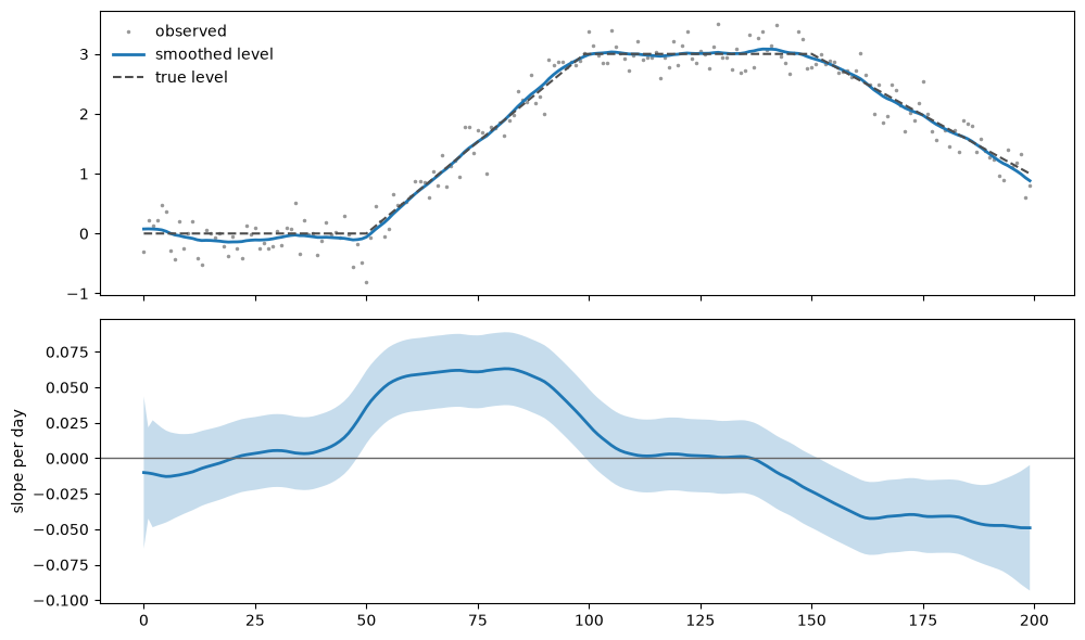
In a local linear trend model the slope is a state, so its uncertainty is a diagonal entry of the smoother covariance. The interval is conditional on the fitted state variances.
regime = np.concatenate([
    np.zeros(50), np.linspace(0, 3, 50), np.full(50, 3.0),
    np.linspace(3, 1, 50),
])
regime_df = pd.DataFrame({"value": regime + rng.normal(0, 0.25, n)}, index=index)

kalman = kalman_trend(regime_df, with_uncertainty=True)

fig, axes = plt.subplots(2, 1, figsize=(10, 6), sharex=True)
axes[0].plot(t, regime_df["value"], ".", color="0.6", ms=3, label="observed")
axes[0].plot(t, kalman["smoothed_value"], lw=2, label="smoothed level")
axes[0].plot(t, regime, "--", color="0.3", lw=1.5, label="true level")
axes[0].legend(frameon=False)

axes[1].fill_between(
    t, kalman["derivative_ci_lower"], kalman["derivative_ci_upper"], alpha=0.25
)
axes[1].plot(t, kalman["derivative_value"], lw=2)
axes[1].axhline(0, color="0.4", lw=1)
axes[1].set_ylabel("slope per day")
plt.tight_layout()
Seasonality is preprocessing
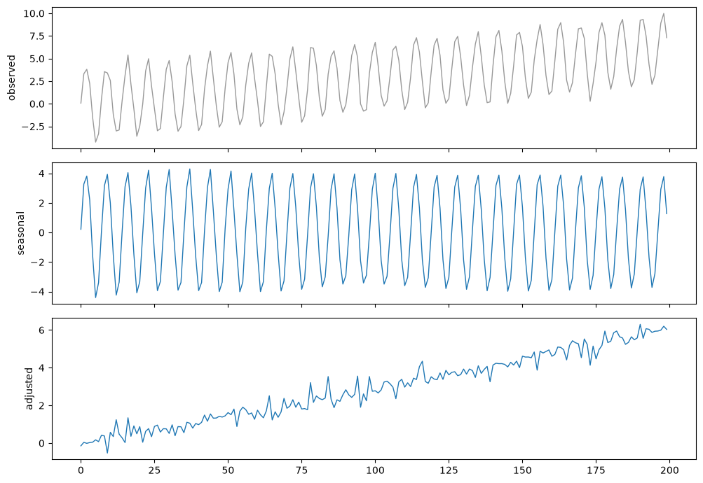
deseasonalize returns a DataFrame, so it composes with every estimator rather
than needing one of its own.
seasonal_df = pd.DataFrame(
    {"value": 0.03 * t + 4 * np.sin(2 * np.pi * t / 7) + rng.normal(0, 0.4, n)},
    index=index,
)

parts = deseasonalize(seasonal_df)
print("detected period:", parts["period"].iloc[0])
print("method:", parts["decomposition_method"].iloc[0])

fig, axes = plt.subplots(3, 1, figsize=(10, 7), sharex=True)
axes[0].plot(t, parts["value"], color="0.6", lw=1)
axes[0].set_ylabel("observed")
axes[1].plot(t, parts["seasonal_component"], lw=1)
axes[1].set_ylabel("seasonal")
axes[2].plot(t, parts["deseasonalized"], lw=1)
axes[2].set_ylabel("adjusted")
plt.tight_layout()
detected period: 7
method: stl
Any smoother can then be applied to the adjusted series:
adjusted = trend_with_deseasonalization(
    seasonal_df, SavitzkyGolay(window_length=21), with_uncertainty=True
)
print(adjusted[["derivative_value", "derivative_standard_error", "uncertainty_method"]].iloc[100])
derivative_value                       0.046481
derivative_standard_error              0.029014
uncertainty_method           pipeline_bootstrap
Name: 2020-04-10 00:00:00, dtype: object
What that interval covers
The seasonal component was estimated from the same data as the trend, so
treating it as known would make the interval about 10% too narrow. Asking for a
standard error here therefore bootstraps the whole pipeline – decomposition and
trend fit together – which is why uncertainty_method reads pipeline_bootstrap.
Multi-scale analysis
A single bandwidth is a single opinion about what counts as signal. SiZer sweeps the bandwidth and reports, at each scale and position, whether the slope is distinguishable from zero. Persistence shows that a finding is less sensitive to one chosen bandwidth; it is not proof that the feature is real.
multiscale_df = pd.DataFrame(
    {"value": np.sin(t / 30) + 0.3 * np.sin(t / 5) + rng.normal(0, 0.3, n)},
    index=index,
)

sizer_map = sizer_analysis(multiscale_df, n_scales=14)
figure = sizer_map.plot(figsize=(10, 5))
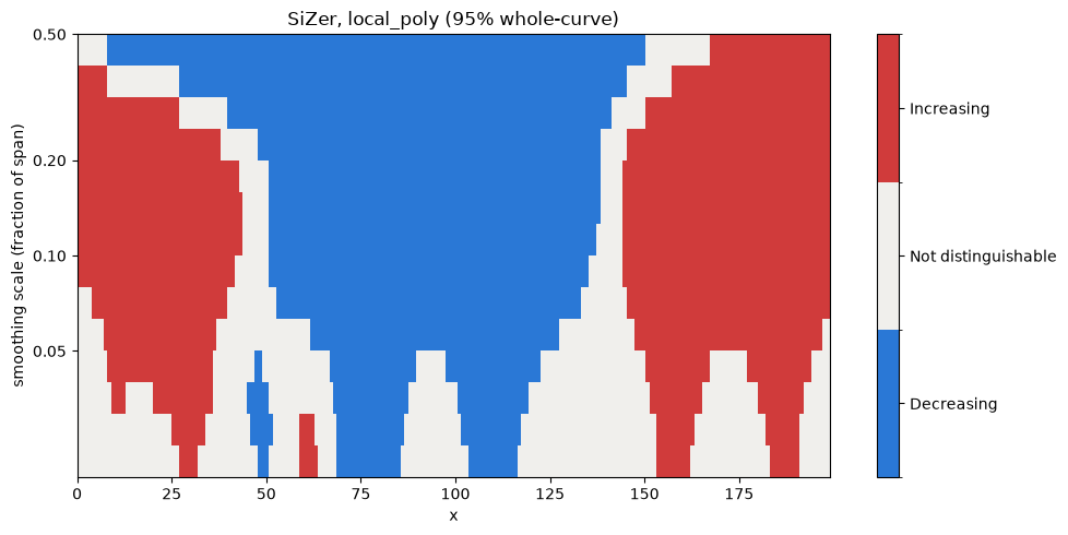
Red is significantly increasing, blue significantly decreasing, pale neither. Because SiZer asks the smoother for its uncertainty rather than computing its own, each cell uses the estimator’s pointwise uncertainty. The map does not adjust jointly across scales.
regions = sizer_map.significant_regions(min_persistence=4)
for direction, spans in regions.items():
    print(f"{direction}: {[(round(a), round(b)) for a, b in spans][:4]}")
increasing: [(0, 41), (145, 199)]
decreasing: [(48, 138)]
Comparing methods on one series
methods = {
    "Savitzky-Golay": SavitzkyGolay(window_length=21, degree=3),
    "local polynomial": LocalPolynomial(bandwidth=0.15, degree=2),
    "Gaussian process": GaussianProcess(n_restarts=0),
    "state space": StateSpace(),
}

fig, ax = plt.subplots(figsize=(10, 5))
rows = []
for label, smoother in methods.items():
    result = estimate(smoother, df, with_uncertainty=True)
    ax.plot(t, result.derivative, lw=1.6, label=label)
    rows.append({
        "method": label,
        "uncertainty_method": result.provenance.uncertainty_method,
        "median se": float(np.nanmedian(result.standard_error)),
        "share significant": float(result.significant.mean()),
    })

ax.plot(t, true_slope, "--", color="0.3", lw=2, label="truth")
ax.axhline(0, color="0.4", lw=1)
ax.set_ylabel("slope per day")
ax.legend(frameon=False, ncol=2)
plt.tight_layout()

pd.DataFrame(rows)
| method | uncertainty_method | median se | share significant | |
|---|---|---|---|---|
| 0 | Savitzky-Golay | operator | 0.041124 | 0.340 |
| 1 | local polynomial | operator | 0.001540 | 0.965 |
| 2 | Gaussian process | native | 0.003661 | 0.960 |
| 3 | state space | native | 0.015373 | 0.815 |
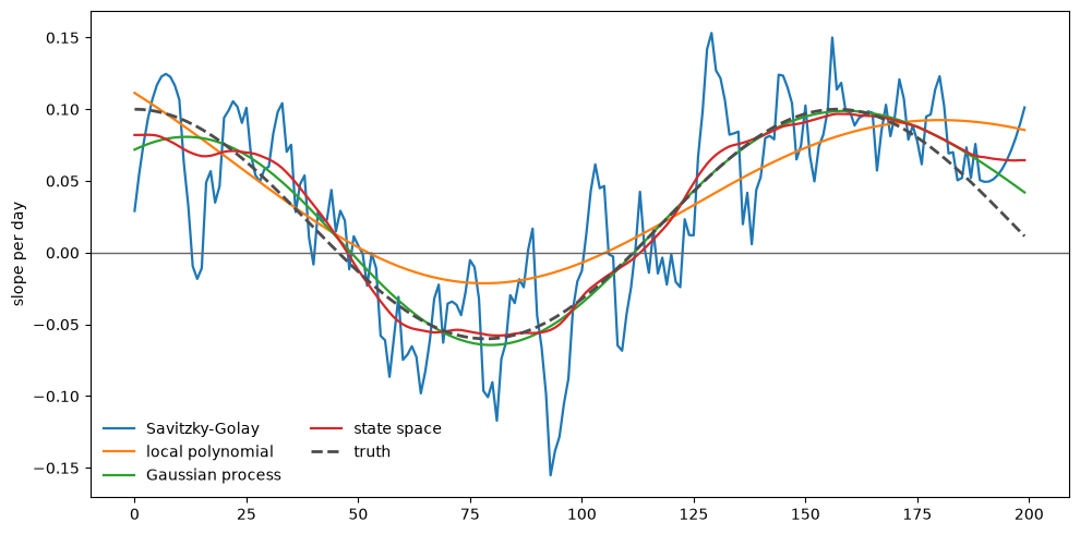
The uncertainty_method column is the point. operator means the estimator is a fixed
linear map of the data and its variance is exact conditional on the fitted or
supplied noise covariance; native means it is a
probability model that already knew its own posterior; bootstrap means neither
applied and the sampling distribution had to be simulated.
When the noise is correlated
The default assumes independent errors. Under real autocorrelation that understates the uncertainty badly — measured against Monte Carlo truth at φ=0.7, the reported standard errors come out around a quarter of their true size, and nominal 95% intervals cover about 40% of the time.
phi, sigma = 0.75, 0.5
noise = np.empty(n)
noise[0] = rng.normal(0, sigma)
for i in range(1, n):
    noise[i] = phi * noise[i - 1] + rng.normal(0, sigma * np.sqrt(1 - phi**2))

correlated = pd.DataFrame({"value": 0.01 * t + noise}, index=index)

independent = sgolay_trend(correlated, window_length=21, with_uncertainty=True, noise="iid")
modeled = sgolay_trend(correlated, window_length=21, with_uncertainty=True, noise="ar1")

fig, ax = plt.subplots(figsize=(10, 4.5))
ax.fill_between(
    t, modeled["derivative_ci_lower"], modeled["derivative_ci_upper"],
    alpha=0.25, label="95% interval, AR(1) noise",
)
ax.plot(t, independent["derivative_ci_upper"], lw=1.2, color="C1",
        label="same interval assuming independence")
ax.plot(t, independent["derivative_ci_lower"], lw=1.2, color="C1")
ax.plot(t, modeled["derivative_value"], lw=1.8, color="C0", label="slope")
ax.axhline(0, color="0.4", lw=1)
ax.legend(frameon=False)
plt.tight_layout()

print("points called significant, assuming independence:",
      int(independent["significant_trend"].sum()))
print("points called significant, modeling AR(1):      ",
      int(modeled["significant_trend"].sum()))
points called significant, assuming independence: 141
points called significant, modeling AR(1):       0
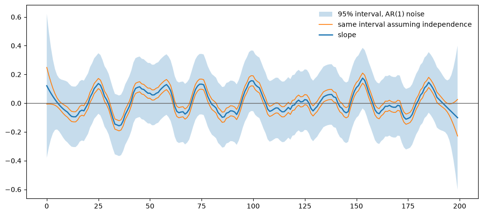
The series has no trend beyond a slope of 0.01 per day. The gap between those two counts is how many apparent discoveries the independence assumption manufactures out of wandering noise.